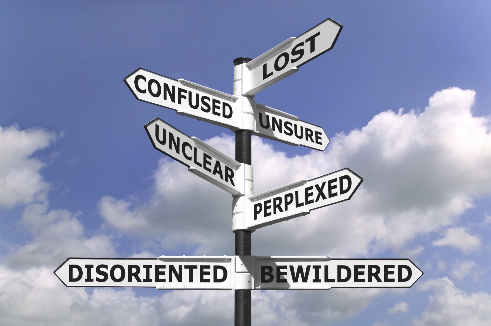
Many User Experience based design recommendations are based on one important truth: People who arrive at your website are often only prepared to give the page a quick scan to see if they can find what they are looking for. If they can’t find it, they’ll leave. The same holds true even for people who have navigated around a bit, but then get to a stage when they are looking for an additional step, or another bit of helpful information, and it eludes them. They’ll leave.
Recommendations around naming and labelling are incredibly important to pay attention to for exactly this reason. The most fundamental thing to keep in mind is to label things clearly and simply, and say things as they are. Here are some important points to remember when naming and labelling things on your website, or app:
- This is not the best area to be creative, and come up with novel names and labels. Instead, rely on the work done by millions of other websites, in teaching people the normal names for things, and go with what’s conventional. Call your homepage ‘home’, your about page ‘about’ or ‘about us’, and your contact page ‘contact’ or contact us’. Call your e-commerce homepage the ‘shop’ if it isn’t the main homepage of your website. Name your other pages the most simple and obvious description of what they are, e.g. ‘products’, ‘services’ etc. It’s better for your users to not even think for a second when they are trying to find information on your site, than to perhaps be impressed with your creativity when they discover that ‘The foundry’ is actually just your online shop.
- Use ‘alt text’ for all your images. This is added in the HTML, and can be easily added with CMSs like WordPress. This is the text that appears when you hover over an image with a mouse cursor. It is also what gets read out to people using screen readers, as most blind people do, and its also what search engines see.
- Always include clear page titles on your website. Remember, lots of visitors will arrive at pages deep in your site, and will have never visited before. When they arrive its helpful for them to know exactly what the page is about. This can even be true of people that arrived at your homepage, and have been navigating around. For first time visitors especially, it is easy to get lost in a site, and lose place of where you are. Using clear page titles helps immensely.
- Following on from the idea of helping people orient themselves, it’s a great idea to include signposts, in the form of breadcrumbs. Breadcrumbs are links back to the pages higher up in the website hierarchy to the visitor’s current position/page. So on an e-commerce site for example, whilst on a page for a Samsung LED TV, you could have some small links near the top of the page like this: Home > Audio Visual > Television > LED > Samsung LED TV. This helps visitors understand where in the hierarchy they are – especially helpful on a large website, with lots of pages. It also helps thm navigate up the ladder, if for example they want to go back and see all TVs.
- Don’t rely entirely on icons. Icons are great, and they can be a great visual aid in helping people understand what different action buttons etc are on a website, but it’s not a good idea to rely on them completely. This depends a bit on who your usual visitors are, and they level of technical proficiency. If they are web developers that know that a little pencil icon will mean ‘edit’, then you might be able to get away with just using a little pencil icon. If however, they are ordinary people, who might not be very experienced with web browsing, then instead of a ‘standard’ three line menu icon on a mobile site, why not have a button with the word ‘menu’? Everyone understands that – it’s simple and quick to process.
- Always make sure that you have user friendly URLs. The URL is the address of a web page (e.g. http://www.mydomain.com/shop/rubber-duck). A lot of websites have URLs that are impossible for a human to understand, something like: http://www.mydomain.com/_3Eg/?prod_id=328376. This is not only bad from an SEO perspective, but also for usability. Lots of people use the website address/URL to find out where they are in a website, and even to navigate. For example in the first example, it is easy to see that you are on a product page for a rubber duck, and that you can probably buy it, seeing as there is ‘/shop/’ in the URL. It’s also easy enough then to delete the ‘rubber-duck’ bit, and quickly go to the ‘shop’ section. Having clear, well-structured and human readable URLs is a great usability enhancement. Remember – most of your users will arrive at pages not by navigating through from your homepage, or another page, but instead arriving straight from a search engine or a link shared on social media. Make things as obvious as possible, using all the signposting and labelling tools available.
- Finally, don’t underestimate the value of a good tagline. A tagline is a brief description of what your website is, usually in a handful of words. Lots of people have a tagline that accompanies their logo. Another great place to have a tagline or two is on the homepage, as the first thing that a user sees. When people are searching online they are often overloaded with information, but they are looking for something specific. It’s best to be the website that lets them know as quickly as possible if they have found what they’re looking for, in clear and simple language. Some examples: ‘South Africa’s favourite online shop’ – Kalahari.com, ‘Travel made simple’, ‘Search and book cheap flights’ – Travelstart.co.za and ‘Empower people around the world with a $25 loan’ – Kiva.org
So, as some final words, when writing copy, titles and labels for your website, keep things simple, concise and to the point. Use plain language that the largest amount of people will understand. Write for humans.